

BusyBee
The Brief
As a project of DesignLab Academy, I created a mobile-first responsive website for event planners, that quickly turned into a project management platform.
In today's fast paced world, it can be hard to keep up with your own agenda as well as being able to work with your teammates seamlessly. BusyBee aims to bring together simple widgets to help you stay organized and streamline communication in a simple and fun way.

Intended Audience
-
Students
-
Home caretakers
-
Event planners
-
Anyone who uses an agenda
-
Age ranges 14-50
Tools


Role
UX/UI Designer

Research Goals
Understand what people's priorities are when planning an event.
See what challenges people face and how other platforms tackle (or don't tackle) it.
User Interviews
The Users
The Interview
Most interviews were done over Vowel, a free, online video conference platform that provides real-time transcription during recording. Other interviews were done over the phone and were voice recorded.
Scripted questions include:
-
What kind of events do you normally plan?
-
How often do you plan events?
-
What kind of programs to do you use to do that?
-
What are some priorities when you’re planning an event?
-
Can you please describe your event planning process to me step by step?
-
What are some frustrations you run into?
-
Are there any features in any of the programs that you use that you wish existed?
-
How do you feel about the general outcomes of the events that you plan?
-
Do you think there’s anything in the aftermath of the event that could help plan the event better?
-
What would deter you from using a certain product/software?

Interview Outcome
-
Collaboration is a huge factor
-
Want to be able to integrate different platforms such as Google and Microsoft
-
Want to be able to create guides and custom templates for annual events and passdowns
-
Want easy navigation and search features
-
Looking for intuitive ways to organize team members and projects
-
Want drag and drop feature
Affinity Guide
I organized each person's points into an affinity guide under these categories:
-
Deterrents
-
Outcomes
-
Process
-
Wanted features
-
How often usage
-
Pain points/frustrations
-
Type of events
-
Priorities
-
Programs used
-
Misc. Details

Personas
Meet the two personas created based off these results:
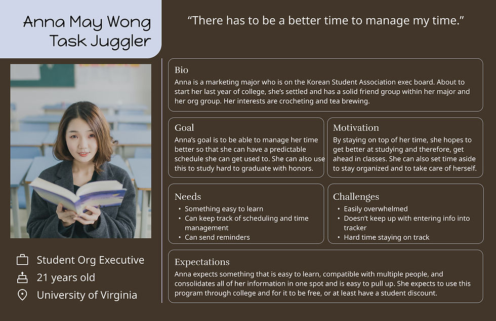
Anna: an active college student who stays on top of her classes and student organizations. She is looking for a free platform that can help her keep track of all her classes, extracurriculars, and household all in one place that's also compatible with her school accounts.
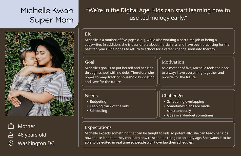
Michelle: a mother of five who wants to find an intuitive platform that her kids can easily learn. With so many people in a wide age range, scheduling plans and budgeting can get hard and easily miscommunicated. Michelle wants to find a platform that allows a shared calendar and collaboration on files.
Competitive Analysis
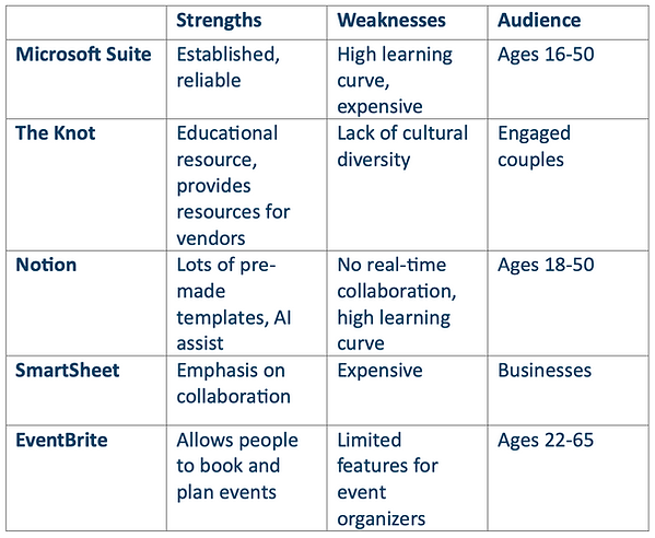
I did a competitive analysis of different "event planning" platforms out there.
After researching a diverse of event planning platforms, I started to steer towards project management features such as Microsoft Suite, Notion, and SmartSheet, as I believed that would help event planners (such as past me) become more organized.
Maps and Flows
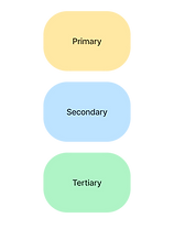
Site Map Legend
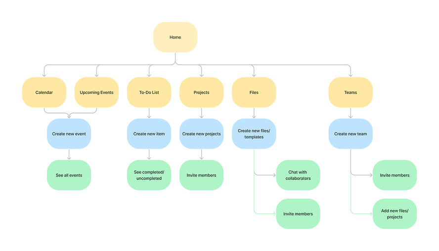
I created this site map on the basis of keeping things simplistic and having things quick and easy to access.
After creating the site map, I then created a few task flows to visualize the pages of future tasks that I want my user to prototype.
Task flow legend

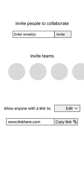
Task 1: Invite a collaborator to edit a document

Task 2: Add an event to the calendar

Task 3: Add a reminder to the to-do list


Sketches and Wireframing
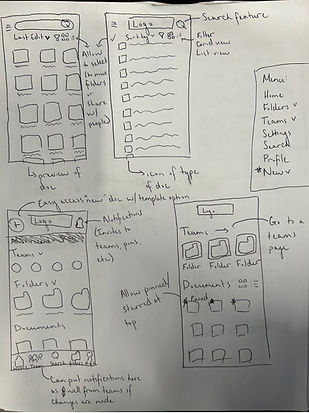
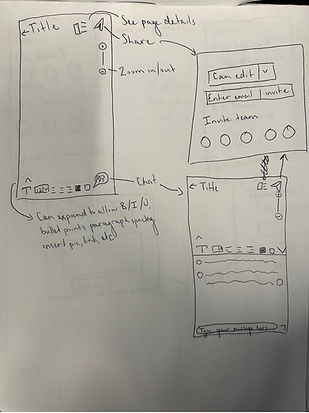
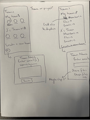
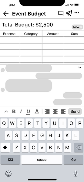
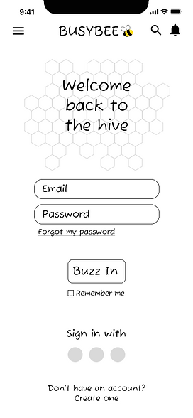
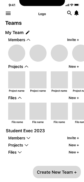
Low-fidelity sketches of featured pages such as a files page, teams, a chats feature on an opened file, invite to collaborate page, etc.
First mobile-responsive digital wireframes:
See the full Figma draft file here.
Dashboard

Sample Budgeting Template
Sign In Page
Teams Page
Invite to Collab Page
First web-responsive digital iterations:
See the full Figma draft file here.
Dashboard

Teams Page

After designing the first iterations, there were some things that I came to realize and also got feedback on.
-
There was no reason for the floating action button (FAB) on the mobile dashboard page.
-
If the teams and projects feature was a huge part of the platform, then there should be a teams section on the dashboard.
-
I needed a more streamlined way of adding to the calendar.
-
There was almost NO whitespace on the dashboard and footer.
-
Things needed to snap to grid. While most things were aligned, there were still things that fell off the grid and seemed out of place.
After multiple iterations, these were the high-fidelity for usability testing:
See the full Figma draft file here.
Dashboard

Home Page
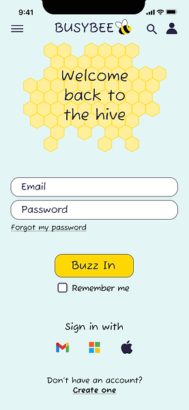
Home Page
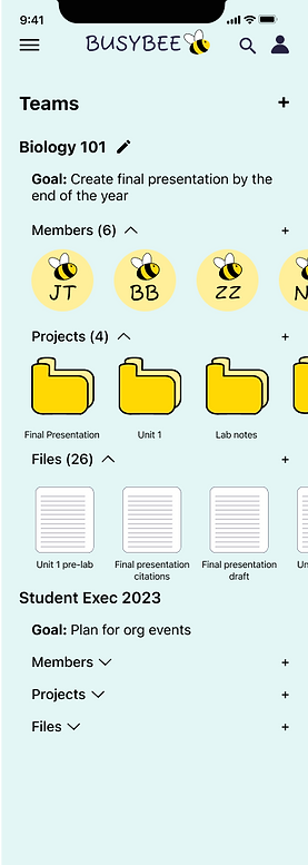
Calendar Page
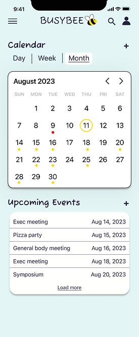
To-Do List


Usability Testing
The Users
The Testing
The main KPIs that I'm looking at are ease of use and success rate.
When I first show them the prototype, I give them some time to go through and explore a little to see what features are available. In addition, I explain that textfields are pre-filled and they don't have to physically type anything in. Lastly, I reassure them that there's no problem if they are unable to complete a task.
Tasks:
-
Please show me how you'd add an event to the calendar
-
Please show me how you'd add a reminder to the to-do list
-
Please show me how you'd invite someone to collaborate with you in the "Event Budgeting" file.
Follow up questions:
-
On a scale of 1-10, 1 as the easiest, 10 as the most difficult, how would you rate the tasks?
-
Is there anything that you found difficult about the tasks?
-
Is there anything you would improve on this platform? Is there any features that you wish it had?
-
Do you use anything similar to this? What do you like/dislike about it?
Testing Outcome
What worked
-
5/5 users successfully completed all 3 tasks. All 3 tasks were completed in under 5 minutes.
-
5/5 ranked it about 2-3 on a 1-10 scale difficulty.
-
5/5 said it was straightforward and easy to use.
-
"Color scheme is cute and fun!" - Amanda Burns
What needs work
-
Need a confirmation page once a task is completed.
-
3/5 participants expected to be able to add an event to calendar by directly tapping on the calendar.
-
Would be great if calendar could be color coded or categorized.
-
Color scheme was good, but the page lacked depth.
-
Notifications should be a more accessible feature.

Final Iterations
See the full Figma draft file here
Dashboard
Before

Notifications are more easily accessible
After
Can now directly create an event by clicking on a date on the calendar in addition to having a color feature.


I've added drop shadows to create depth between sections.


Confirmation Page

I added a feature to categorize events by color.


A confirmation box was added that confirmed the name of the event.

Challenges
Time Constraints
Learning UI
As a first project of the UX DesignLab, this is done over the span of 3 months in addition to courses on becoming a UX/UI designer.
I loved the UX portion and interviewing people but once it came to the UI, it was a huge challenge for me, especially when it came to color schemes and white space.
Limited Features
As much as I wanted an end-to-end project, I could only make a few working pages to prototype.
Key Takeaways
User testing is crucial in developing a platform. Interviewing and testing can be done in all stages.
Multiple iterations is needed for a final product (and even then, a product is never "final").


.jpg)
%20(2).jpg)


