Chinese American Heritage Foundation
The Brief
As a project of DesignLab Academy, I revamped an existing website for Boston's Chinese-American Heritage Foundation Group.
Wanting to work on a site for a nonprofit organization, I chose one that's similar to one that I have previously worked with before.
Mockups currently in progress - here's a picture of my friend's cat instead!
Intended Audience
Tools
-
Volunteer workers
-
Students
-
Community members
-
Chinese-American advocates


Role
UX/UI Researcher
Research Goals
Redesign the website for a better user experience
See what pain points users have been running into when signing up for a non-profit.
Find ways to prioritize the non-profit's goals.
User Interviews
The Users
The Interviews
Interviews were done over in-person with an audio recording, over the phone and were voice recorded, and over Vowel, a free, online video conference platform that provides real-time transcription during recording.
Scripted questions include:
-
Have you ever been involved with a non-profit?
-
What do you think non-profits are for?
-
What kind of information do you expect to find on a non-profit site?
-
What kind of non-profit would you support?
-
Have you ever donated to a non-profit? What was the process like?
-
Have you ever supported any Asian non-profits? If so, which one? How was that experience?
-
Did you face any frustration with your experience in supporting non-profits?
-
How do you think this frustration can be alleviated?
Interview Outcome
-
Majority of the interviewees agreed that the organization they worked with is disorganized.
-
There are multiple things that organizations can do to better themselves such as a more defined system, better UI, confirmations, etc.
Affinity Guide
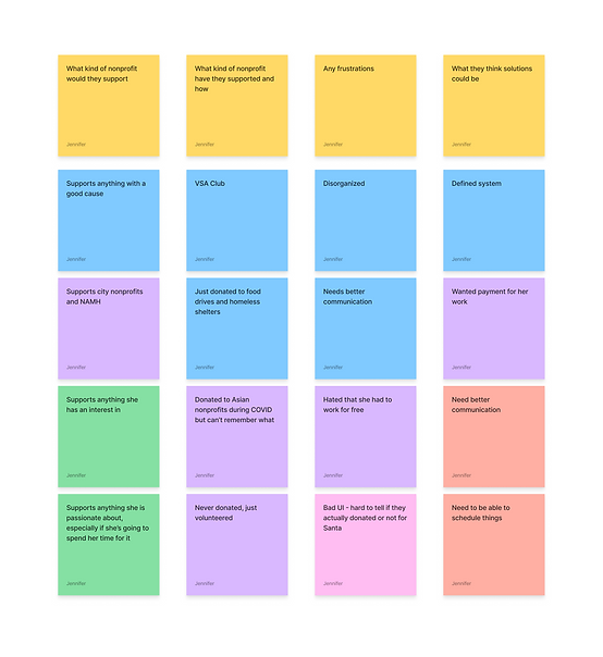
I organized each person's points into an affinity guide under these categories:
-
How they were involved
-
What they think non-profits stand for
-
What should be on the website
-
What kind of non-profit they would support
-
The kind of non-profit they support and how
-
Frustrations
-
A solution to the frustration
Personas
Meet the two personas created based off these results:
Anthea: a recent college graduate who wants to help her community and get more involved in extracurricular activities. She wants to help foster a safe place for immigrants to meet new people.
Simon: a senior accountant who is stable in life and is looking for new things to do. As he is looking to make new friends, he always wants to contribute to a community that shares in his beliefs and values.


Competitive Analysis
I did a competitive analysis of different Asian non-profit organization websites. After researching a few different Asian non-profit websites, I started to get a sense of what I visually wanted for my UI and what features I want and don't want to add. See the full file here.

Task Flows
The site map for this mockup was a flat map. No pages within pages. Because of that, I only had two main tasks at hand that I wanted people to be able to do: Sign up to volunteer and make a donation, both following very similar paths.
Task 1: Make a donation

Task 2: Sign up to volunteer

Task legend

Sketches and Wireframes


Low fidelity sketches of main pages such as the home page, donation page, and the upcoming events page.
First web-responsive digital iterations

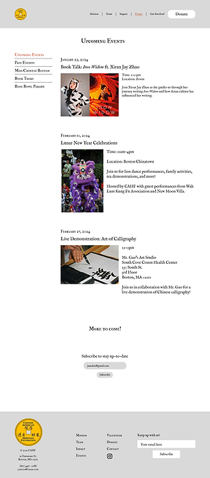
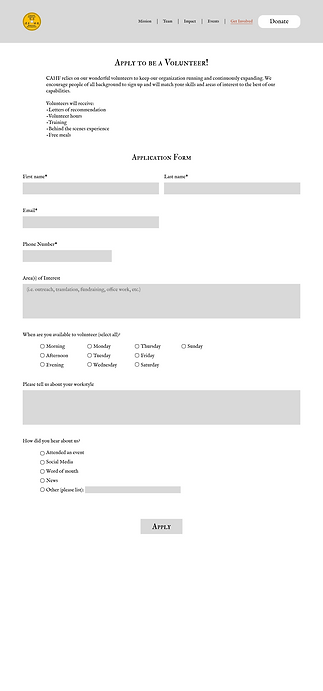
After design and testing the first iteration, there were a few things that I had to fix:
-
Even though they looked nice, the small fonts were hard to read, especially the numbers. I had to find a new font that still fit the theme but legible.
-
Fonts and buttons weren't consistent. I needed to make buttons and components for them.
-
The navigation bar wasn't as intuitive as I expected as 4 of the 8 participants had trouble finding the volunteer button, or found it in a roundabout way.
-
There wasn't very much white spacing in the buttons or textboxes.
-
I needed a phone responsive design.
High Fidelity Wireframes
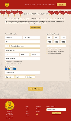
After multiple testing, I came up with the final UI and wireframes. See full draft here.

