Wayfarer
The Brief
As a final project in Design Lab Foundations, we were to create a desktop landing page as well as three mobile pages for a travel company called Wayfarer. This company's mission is to provide travelers, mainly a target audience of 21-30, information and research to new locations to visit around the world. They've provided brief description, a few images, and the logo to work with.
Drafts


The requirements listed:
-
Navigation to other pages/sections
-
Simple search for destinations
-
Grid/list view of featured destinations
-
Call-to-action to sign up for a newsletter
-
Footer including a copyright date and links to other pages
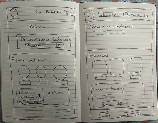
I knew that my hierarchy should be somewhere along the lines of navigation > hero image (featuring search bar) > featured destinations > CTA newsletter > footer.
Because it seemed like the target audience was young travelers, I wanted to aim for colors that coincided with nature, like sunset colors.
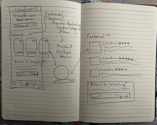
In the end, I drew up 4 sketches, although I continued coming up with things to incorporate after. For example, I decided to incorporate the hover state on top of the cards (with advice from my mentor to add a cursor overtop to show that there's a hover state). Because of that, I didn't add a "favorites" button because that would have crowded too much.
This worked great as I decided to put the titles of each card at the bottom of the card rather than underneath it. This worked because I put a gradient overlay on top of the card so that it'd be dark under the letters while the picture shows through.
As for the categories, I wasn't sure whether to put "About," or "Popular," or "Featured." In the end, I put a little bit of everything. As a user, I like sites that give a lot of options, especially on the home page where I don't have to dig deep into the website. Plus, the more options on the home page, the more options that I'll believe the site has.
On the mobile version, the following were required:
-
Screen 1: List of destinations
-
Screen 2: A destination detail screen
-
Screen 3: Sign-in screen
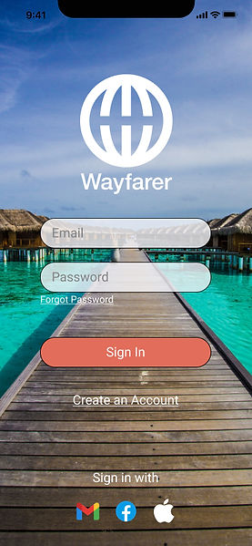
I started with a sign-in screen. I created one that had everything on one page (sign in, create an account, and sign in with Gmail, Facebook, and Apple). I drew up another draft with a two page sign-in to see if I might like that better, but I didn't.


Onto the destination details page next, the more I drew, the more I wanted to incorporate. Priority was the location itself. For sure, I wanted these: About, reviews, attractions, more photos, and favorite. Nice to have would be: x km away, fast/fun facts, accommodations, food, flights, weather, cost, map, and safety (especially as a girl). [Side note: metric and imperial can be changed in the settings.] Problem is, how do I incorporate everything without overloading the page? Through putting together lots of drafts.


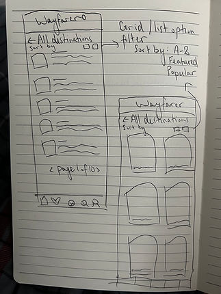
For the list of destinations page, I had misinterpreted that as a mobile home page. I converted a quick draft of a mobile home page by taking the cards and creating a card/grid view from it. I decided to make the list view as I felt the grid view would just be copy/paste of the cards from the home page and I wanted to challenge myself to something new.
Prototypes
As I continued to work on the digital iteration, the font placement shifted according to the grid.
The Academy provided the text and logo.
Through mentor guidance, I added arrows after each category to show that it links to more.
I decided to add in featured photos to break up sections and have it not as monotonous.
I then decided to categorize them by locations.


With my log in screen, I rounded the edges of the text boxes and button so it doesn't look so sharp, especially in comparison to the logo. I also liked the bridge background as it "leads" into the app.
For the list of destinations screen, I liked having reviews with each destination next to a featured image of each page.
I added the option of being able to sort and filter through, as well as being able to switch between grid and list view.
At the suggestion of my mention, I also added a back button.

In my drafts for the individual destination page, I tried coming up with as many features as possible:
-
About section
-
Fun facts
-
Photos
-
Weather
-
Map
-
Attractions
-
Accommodations
-
Flights
-
Reviews
-
Favorite
-
Safety
-
Foods
-
Tips
-
Money
Fitting all this in using one method became messy and crowded so I had to employe as many methods as I could.
I used a photo carousel to add more photos and gave a condensed version of an average prices and reviews below the location. I also wanted to give an idea of distance (maybe through location services?).
About section would take priority and then I used drop down menus for smaller things that are easy to skip over. Originally, I put both Fahrenheit and Celsius, but that became crowded. I figured this may be better off as a "settings" feature.
I gave cards for Attractions and Accommodations to give a visual appeal.
I expanded Reviews for extra details of what others said, which can also expand if people were to click the tabs.
For categories that led to more information, I put them on buttons that would lead to another page.

Conclusion
What I Learned
As the final project of DesignLab's UX Foundations course, I had learned many things such as color schemes, typography, iconography, layout/whitespace, use of grids, and more. This project sharpened my Figma skills and working with a mentor really helped me see different points of view and catch things that I miss.
Next Steps
-
DesignLab's UX Academy! It's time to challenge myself to the 6 month long bootcamp
-
Continue with this project and keep making more pages (such as the search page, settings, profile, etc.)